Practice Photos


This is a picture of me and my friend at last years homecoming. For this picture I made it have a more blue tone and lightened up a few areas with heavy shadows.


This picture is from this years homecoming with another one of my friends. I thought the picture was too dark so I lightened it and I also gave it more warm tones to make it look more sunny out.
Fall photos


This is a picture of my cat Aladdin and I liked how he was laying down very relaxed. For this photo I chose to lighten it up because his fur is very dark and I gave it very blue tones to match the fish tank light that was popping out too much.


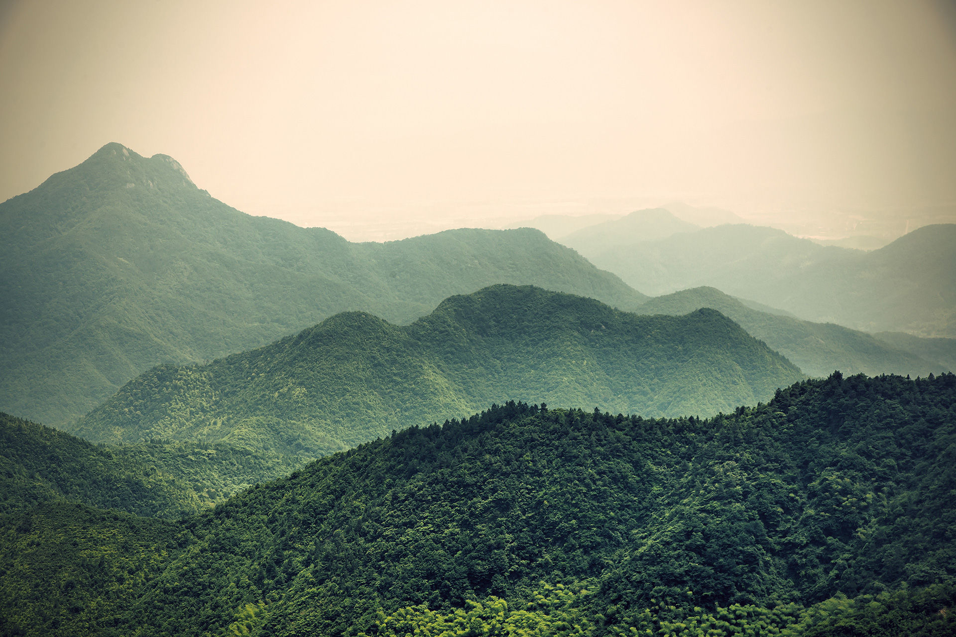
This Photo Collection was a representation of Iowa in the Fall. I chose the take pictures at the Quarry at Crow Creak park because I think it is a very cool place and it has a lot of different elements in it. My favorite picture from this collection is the one with the leaf in the water because I like how I intensified the colors and I like the balance of the photo.
These are the two images I chose to watermark because I thought these were two of my stronger photos and I don't want them to be stolen. I'm glad we learned how to do this so our future works won't be stolen.


Letter assignment
For this assignment we had to find objects that made letters to spell out our names with. I used objects that were laying around the house for my letters. The way I edited this was adding in lighter shades of the original colors to give them a little pop and this is more effective because these images are black and white.


For this collection I picked out the items I thought looked the most aesthetically pleasing to me and I wanted them to also look good together. The way the objects in your photo is really important because you want to catch the viewers attention whether it's good balance or you use complimentary colors. I made my objects look like they were placed naturally in their spots and I made sure I had good balance in my photos. I made sure the backgrounds would work with the objects and would be good elements of the photos. My favorite photo in this collection is the first one because I like the balance and I like it's highlights. My least favorite is the second one because even though it is balanced it just looks too staged and unnatural. Next time I take photos I will remember to make sure the background is okay.


I thought this photo set was pretty good. For my double exposures I think I did good for my first time doing those even though they are very odd. I turned the opacity down a little so the texture layers were translucent enough to see whats underneath. I think photo six was very interesting because I wanted to edited the texture on my friend and I because I thought it would look cool but i feel like it turned out a bit creepy. I think image 7 has a very interesting style and I'm pretty pleased with the results. Overall y favorite is the rain drops because it is simple and clear, also because I like taking pictures of water.